
So, you like to draw, and you like comics. You've got a good story and want to make a web comic. But you're just starting out, and not sure where to go for help. Or, worse, you've been through Youtube and asked around, but found yourself confused by all the different answers, or the lack of answers; as it seems some people are fairly tight lipped about their process.
You, my friend, are right where I was not too long ago. I know how frustrating it can be. You have the passion, the ideas, and even the software (In this case, Photoshop.), but no idea how to get started. Well, your friendly Conductor is here to help get you started down your own track to web comic fun.
Below is how I, with Photoshop CS5 (These steps will work for most editions of Photoshop.), and hand drawn pages, go about making both Galactic Gun and Stuff, over at Neverland Transit Authority.
So...

First things, first. You need to scan in your art. Here I've imported page 14 of the current story line Pocket Full of Posies. To insure good line quality I like to use a larger dpi (Dots Per Inch) setting; usually 300 dpi.

Next up, you'll need to get rid of as many stray marks and set up lines as possible. In my case, I draw with a "non-photo blue" pencil; a left over habit from the old days, I suppose. Go up to Select in the tool bar and pull down and select Color Range.

In the dialog box, hit the pull down menu and select Highlights. This will isolate anything below the black value.
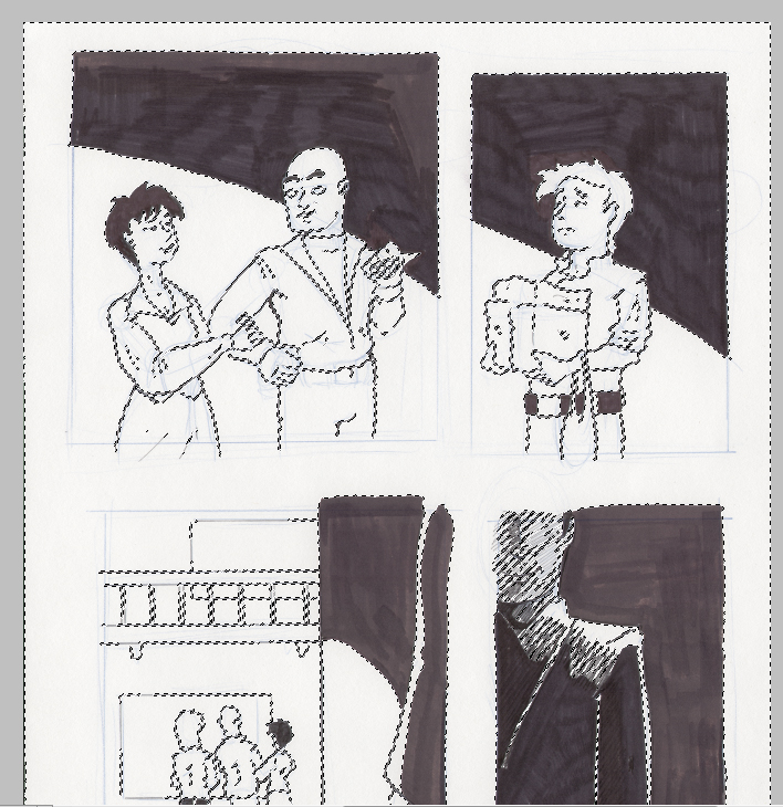
When you hit "okay" you'll see the "marching ants" come up on the page. They'll surround all the highlight areas. It's a good time, here, to check and make sure that all the lines and areas you want to keep haven't been selected. Otherwise, they won't survive the next step.
With those areas selected, go up to Edit and select Cut. You can also use the keyboard short cut [ctrl +x] on the PC, [cmnd + x] on Mac. When you do that, you'll end up with this...

Depending on how you draw up your comic, you may not even need to do this step. But, if you do a lot of erasing, or, like me, use lightly off colored pencils, then this will clear up and non erasable marks.

Now that the page is fairly clean, you'll need to finish prepping it to add color. To do this, it needs to become a layer. With the layer selected in the layers panel right click (cmnd click on Mac) and select "Layer from Background". A dialog box will open to name the layer. Name it as you see fit. I've named my line layer "77 p14".

Okay, so, we still need to get these blacks to black. The best, and easiest, way I've found to do this is by going up to Image in the tool bar and selecting Auto Tone. This adjusts the tone values to a preset value; whites get whiter, and blacks get blacker.
Once you get the values you want, repeat the first step, again; go to Select, pick Highlights in the drop down menu, click "okay", and then cut the highlights. When you've done that, it should look like this...

However, your blacks still might not be black enough. In that case, you can go back to Image and select the Adjustments option.

Pick Brightness/Contrast and you'll get a dialog box with sliders. Adjust the "Brightness" slider as needed.
If everything goes right, you've created something a little like a wire frame, of sorts. Essentially what you've got is all your line and ink work isolated on a single layer. From here on out, it's important to remember that this layer needs to sit on top.
Next, you'll want to set up some panels. There are a couple of ways to go about doing this, but here's the simple, down and dirty, version...

In the side tool bar, grab the rectangle shape tool. If your frames are rectangular, that is. You can use whatever shape works best, really, but, here, for this example - since most panels are some sort of rectangular shape, I'm suing this shape.
With the foreground color set as white, click, and hold on a corner where you want a panel; dragging until you've covered the entire area you want. Release. The first time you do this, the rectangle will appear over the lines. Don't worry; just go over to the layers panel and drag the shape under the lines.

Repeat this step for each panel you'll need. You may also need to correct for size, sometimes; especially if you're more loose, like I am, in your set up. The best way to do that is go up to Edit, select Transform, and then Scale. When the scale guides appear, you'll be able to click and drag the shape to the correct size; adjusting sides individually, as needed.

This is a good point to stop and do a little clean up. By right clicking on each layer (cmnd clicking on Mac) you can rasterize the shapes - which makes them easier to work with, and rename them. It's not necessary to rename your layers, but it does make working with them much easier; avoiding accidents and confusion, later on; particularly when you have more complex pages.
Here I've also cleaned up stray lines that go outside the panel. You'll have ample opportunity to do this, but I find it easiest to do a little clean up as I go, here and there.
At this point I add layers for all the characters and objects I'm going to be adding color to in the panel, and naming them. You can add layers all at once, or, as you go. It all depends on you.

Since this is the down and dirty simple version, you'll be applying color to large areas equally. The best way is by selecting areas using a lasso tool, which you'll find on the side tool bar. Click and hold to see your options. I have a Wacom tablet, so I usually select the regular lasso tool. If you're using your mouse, you might find the polygonal lasso easier to use; you click and set the selection by setting anchors along the way with another click.
Either one is fine, based on your comfort level and expertise.

With your lasso selected, click on the layer you want to add color to, and outline that area.

Go to the bucket tool on the side tool bar. It sometimes lives behind the Gradient tool, so if you don't see it, just click and hold to make it appear. With the opacity set to 100%, move your cursor into the selected area and click. The entire are will then be filled with that color.
Continue this step for each layer in your panel. I tend to do all my coloring on single layers, but you don't have to. You can have multiple layers for characters, objects, or whatever you're coloring in your panel, just fine. I just prefer keeping things as simple as possible for the sake of organization and time.
If you do color on multiple layers per object, remember to name your layers and keep track of how they're stacked.
Once you've got it colored, you're obviously going to want to add some volume with shadows.

Go back and select your lasso tool. Draw out the area you want to add shadow to. Again, you can either do this on the same layer, or a separate layer; that's up to you.

Select the bucket tool, again, and, this time, in the tool bar above, set the opacity to a much lower value. Here I've used 20%, but different kind of shadows will require different levels of opacity; so set accordingly.

Now, simply click in the area to apply the shadow. Repeat this process, as needed, around your panel. Occasionally you'll need to adjust your opacity; hard shadows on an arm may not look as good on a face, etc. Don't be afraid to experiment, a little, with it. This shadowing method is easy and flexible enough for it.
Once you've got a panel the way you like it, you might want to group it all together, to keep things less cluttered on the layers panel, or to lock the layers to protect them. You don't have to, but it does help keep things organized - and avoid accidents - when you have more complex pages.

At the bottom of the layers panel click the group icon button. It looks like a file folder. Right click the group layer, and a dialog box will open. You can name your new group. I usually name them "Panel 1", "Panel 2", etc.; but whatever works for you is just as good.

Then simply click on your layers and move them into the group. You can do this one at a time, or all at the same time by Ctrl (Or Shift) clicking on the layers. Then they'll move all together.
Again, you don't have to do this step. But, you might find it helpful to keep things clean and organized; especially when dealing with more complex pages.

Repeat this process for each panel. As you get better, you'll learn how to use gradients, and other effects, to apply color and shadows. Also, you'll note that my initial panels are no longer white. Here I've applied color and gradient directly to them. It's totally up to you how to handle it, but I find it faster and easier to use the original panel shapes like this.

However, you may not. In that case, you're going to need to a couple extra steps to finish off your gutters and panels...

First, add a layer below. Here I've renamed it "gutter"; as the spaces between panels are traditionally called the gutter. Select the bucket tool, make sure it's set to 100% opacity, and click it to fill the layer. I've chosen white, but you can use any color you want. For Stuff I use a green gutter, for example.
Next, you might want to finish off your panels with an outline, called a "Stroke" in Photoshop. You don't have to, but it does make for a nice, clean look; helping to isolate each panel and enhance the over all look of the page.
There are two different ways to do this. They're both fairly easy, so I'll show them both to you.


When the dialog box opens, click on Stroke, at the bottom. You can then select the particulars of the stroke; color, size, or even where it appears. As you make each selection, the panel will update; so you'll be able to see how it'll look as you select it.
Press "okay", and it'll become part of the panel, but will not be selectable, again. (Would only be an issue if you wanted to, say, break frame for an effect.)


A dialog box will open. Like before, you'll have the option to set certain particulars for the stroke. However, unlike the blending options box, you will only see how it looks after you hit "okay". To fix it, you'll have to undo it, and try again. The advantage to this way, though, is that you can select the stroke separate from the panel its now attached to.

Here's the same page, finished with boarders and a white gutter. I've even added a stroke around the inside of the gutter to really finish off the page; though you don't have to, if you'd prefer not to. It is, after all, your page; design it as you like.
And there you have it. It may be a little tricky, at first, if you've never done anything like this, before. So, practice as much as you can. Eventually this can lead to more artistic, expressive methods that lend to much richer, fuller layouts. So, remember; keep working at it every day.
Next time I'll go over the down and dirty way to whip out good looking word balloons quickly and easily. Until then, see you in the funnies!
No comments:
Post a Comment