Friday, June 29, 2012

Building character...

Just a couple of bad asses out for a stroll...
Despite the rather tongue and cheek approach I take with Galactic Gun, there are a lot of aspects - some rather serious - I'd like to take the comic and its stories. To that end, I've often wondered how effective the cartooning style I'm often to use is. Times like those produce imagines like these; where I take the pivotal characters of the Galactic Gun universe, and give them a more “realistic” look.

This gives me the more legitimate look, for sure; something needed to be taken more seriously as a Graphic Novelist. But, I wonder... and, maybe worry... if, in getting more to a standard look, I might be sacrificing some of the more expressive tools of the characters and their stories.

Whether I'm trying to use cartoons to express seriousness, or illustrations to be funny, I fear something's going to be a little lost in the translation. All the more reason to keep hunting for that just right look; blending the spectrum of design.

I don't know; what do you think...?

Wednesday, June 13, 2012

My card...

Or, to be more precise, my business card assignment in Studio Design class over at school.


Each one was created in Adobe In Design by making a master page and plugging in the graphics - found at stock.xchng - and texts accordingly. The first three are for the fictitious town of Neverland, Ca. (Pronounced "N'ver-lund" by its residents.); part of my model train layout. The last one, I think, may, with a little more work, become my new personal card.

Saturday, June 9, 2012

Words... In Design

Okay, so these past two weeks we've been learning something about Adobe In Design. I find that, while it's good for paste ups - setting pages, flyers, and the like - it's really not so much a creative tool. And, yet, here I am showing off my creative assignment in a not so creative tool.

Image from Stock Xchng Quote by Charles Bruce Catton

Recipe from Recipes.com Image from www.sxc.hu/

Image from Fbook Covers Words by Charlie Irons (Inspired by A Softer World)

The idea of the assignmnet as to, using the concepts of design, text wrap, paths, and other effects, take any image and set of words to create... well... these. We had to have one that was orented portrait, landscape, and squared. Otherwise, the content was pretty much up to each student.

I do not own any of these images; which are used with the intent for only the project; each are linked to their source. Authors are noted, as well.

Saturday, June 2, 2012

"Up, Up, Down, Down" - Designing a CD single cover

So, over in my Typography class, we've been working on doing a CD cover using only type; no picutres are allowed anywhere. So I grabbed nerdcore rock greats Kirby Krackle, and their quirky "love song" Up Up Down Down, from their self titled debut.

I have to admit that the initial design sort of quickly snapped together. However, I then spent three days obsessing over how the title would go.
In the end, I went with the Komica font. The idea was, in font size and position, to capture the idea of going up, up, and then down, down. The background lettering is in NES Controller font - no, really; it's the Nintendo font used on the actual hardware - and set at 35% opacity. The band logo is imported; I didn't do anything to it.

Since KK is a nerdcore rock band (Comics, video games, etc.), the news print comic strip look was essential to attract its target audience. In that same way the font choice was pretty obvious. (Which is a bit of a lie; you'd be surprised how many comic styled fonts are out there, these days.Yeash...)


And just how quirky is this little love song? Well...

Wednesday, May 30, 2012

The Comic Sans theme!

Finally! A song about a misunderstood, and deserving, font...

No... wait... That's...
I see what you did, there.

To the Sky...


From the great minds of the past to the coming genius of the future; the owrds of Carl Sagan still are as inspiring, and as important, today, as they were in his time...


Sunday, May 27, 2012

Meanwhile... in art class...

Mask, Mug, and The Bottle makes Three by Charlie Irons
Charcoal and pencil on paper
Just in case you thought I'd stop being all artist like in my non-design class. We just started perspective, so expect something wacky and fun, soon.

Soviet blocks...

Unclear about the history of Russia's workers revolt, and the rise - and fall - of Communism? Let Tetris teach you, comrade...

Friday, May 25, 2012

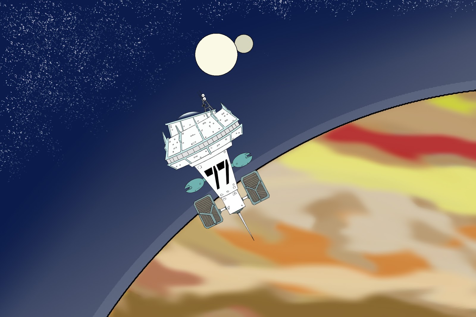
First Look! Galactic Gun: "Twisted Case of Station 77"

You know, I'm good about waiting for Xmas or birthday presents. And I've been very loyal in keeping confidences. But, when it comes to the things I work on for the comics, I'm horrible about about sitting on exciting stuff...


So, here is a rough, first look at the location for our next adventure with Justin Bailey and the crew of the No.7; Galactic Gun: The Adventures of Justin Bailey in The Twisted case of Station 77 from Neverland Transit Authority starting Friday, June 1st, 2012...

I know I'm excited!

Thursday, May 24, 2012

A post from the Nowhere...

So, as you can see - or not see, since there's been nothing new to see, for a while - I've been a bit busy, here at Neverland Transit Authority's Grand Central, to keep up with postings at My Office. Something I seek to rectify in the coming days.

But, what, you may ask, have I been busy with? School...


This little marvel is my first full outing using Adobe Illustrator; the dreadful craptastic program that's the standard in Graphic Design, these days. (Care to ask how I feel about it?)

The assignment was to create a self portrait illustration based off a photo of yourself. So, tell me; how'd I do?

Eh... it's my first Illustrator piece, and that's an old picture, anyway. Meanwhile, in my typography class, we're playing around with letters as design. A lot of my fellow classmates went for regal stuff. Me? I ended up a little off the beaten path...

Taking an upper case "C" in the font "Micro Stencil", I spun a set of four at 90 degree breaks, grouped them, then repeated the grouping down a diagonal path. Then, I repeated the path across the page.

The result, here, is a chain like pattern. Initially I was playing off the stencil breaks to create a path like design. Of course, that's before I noticed that the "C" isn't, exactly, symmetrical.

Oh well, at least I'm happy with the result; which looks a little 1970's style decor texture. (Seriously, I think my mom had a purse with this design in a gold pattern relief.)

In the next couple of days I'll have a slew of posts, including a review of the latest comic news, music reviews, and some other random art. Hopefully, by next quarter, things will have settled down enough where I can get back to doing these things more regularly.

Hopefully...